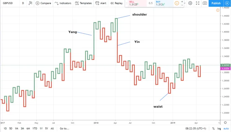
Kagi charts are technical analysis charts used to indicate the price movements of a security. They are similar to candlestick charts but rely on lines instead of bars to represent the price movements.
Kagi charts are created by connecting the highest high and the lowest low of a security’s price over a set time. The lines on a Kagi chart are typically either green or red, with green indicating a price increase and red indicating a price decrease. This article will cover the numerous benefits of Kagi charts and how you can use them in your investment analysis.
Kagi charts can be used to identify trend reversals.


Kagi Charts can be used to identify trend reversals and price points of support and resistance. Kagi Charts are created by plotting price changes on a vertical line and connecting the lines to create a series of peaks and troughs.
The length of each line is determined by the duration of the trend, with longer lines representing stronger trends. Kagi Charts can be used to identify trend reversals by looking for lines that are shorter than the previous line, as this indicates a reversal in the trend.
Kagi charts can help identify price patterns.
Kagi Charts can also help you identify price patterns. When a line connects two points on the chart, the line becomes thicker as the price moves higher and thinner as the price moves lower.
This helps to identify price patterns because it shows how strong the buyers or sellers are at any given point in time. If the line connecting the two points is thick, it means the buyers are in control, and the price is likely to move higher. If the line is thin, it shows that the sellers are in control, and the price is likely to lower further.
Kagi charts are easy to read and understand.
Kagi Charts are easy to read and understand, making them a popular choice for investors. Kagi charts are easy to read and understand because they’re one of the simpler stock market charts available. These charts are created by plotting price changes on a vertical axis and time on a horizontal axis.
The slope of the lines on the chart indicates the intensity of the buying or selling pressure. Kagi charts are one of the simplest stock market charts available because they don’t use any indicators or oscillators, which can be difficult to understand for beginner traders.
Kagi charts can indicate support and resistance levels.

One of the benefits of using Kagi Charts is that they can indicate support and resistance levels. When the price reaches a certain point on the chart, it will tend to reverse course.
So, if you are looking to buy a particular stock, you can watch the Kagi chart to see where the price is likely to reverse and then place your order accordingly. Conversely, if you are looking to sell a stock, you can use the Kagi chart to find points at which the stock is likely to reverse course and then place your sell order.
Kagi charts are not reliant on time intervals.
Kagi charts are also not reliant on time intervals, so they can be used to track shorter-term trends and long-term ones. This can be helpful when you are trying to make trading decisions quickly, as you can get a more accurate picture of the market using a Kagi chart.
For example, if you are looking to buy a particular stock, you can use a Kagi chart to track its short-term trend and decide when is the best time to buy.
Simplify your stock market analysis with a Kagi chart.
As you can see, there are many benefits to using Kagi charts for your technical analysis needs. These charts are easy to understand and helpful for any beginner or intermediate trader.